Exploring the Unique Beauty and Style of Blue Countertops in Kitchen Design

Designers and homeowners are increasingly turning to blue surface tones to introduce character, depth, and a modern edge to kitchen spaces. From watery pastels to brooding indigo, blue offers a spectrum that can be tailored to different aesthetics without feeling trendy or fleeting. The right shade can soften minimalism, balance warm woods, or inject drama into a clean, contemporary layout. Material choice matters just as much as color, and that’s where a thoughtful Granite Selection and other high-performing options come into focus. This article breaks down how hues, materials, cabinetry, and lighting choices collaborate to make blue counters feel purposeful and enduring in today’s kitchens, including how Blue Countertops can unify or stand out in a cohesive design plan.
Color Variations That Shape Mood and Kitchen Identity
Color is the most immediate way blue surfaces influence a kitchen’s personality, and the shade you pick subtly determines how the room feels throughout the day. Deep navy reads as sophisticated and architectural, especially when contrasted with crisp whites or pale woods, while smoky steel-blue leans modern and restrained. Powder-blue or misty sky tones introduce a gentle calm, reflecting more light and amplifying a sense of space—ideal for smaller layouts. Saturated teal and peacock tones carry energy and visual richness, pairing beautifully with warm metal accents and mid-toned woods. By thinking about how the color interacts with light, flooring, and cabinet finishes, you set a clear direction for mood and identity.
Understanding Undertones and Context
Undertones play a major role in harmony: a blue with green undertones complements walnut, rift-cut oak, and brushed brass, while a violet-leaning blue pairs elegantly with stainless and cool grays. Consider the fixed elements in your kitchen—floor color, wall paints, and appliances—so the blue feels integrated rather than isolated. If you love contrast, try a darker blue on a central island and a lighter perimeter palette to maintain balance without overwhelming the room. Conversely, a soft blue across the perimeter can make a minimalist kitchen feel warmer without sacrificing clean lines. The key is to preview swatches in daylight and evening lighting to ensure the tone you love stays consistent across conditions.
Material Choices for Achieving Bold Blue Finishes
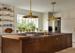
Choosing the right surface is as important as selecting the color, because finish, veining, and texture determine how the blue actually reads in your kitchen. Engineered quartz offers reliable color control and consistency across slabs, making it a strong choice for modern spaces that favor uniformity and easy maintenance. Natural stone, however, introduces dramatic personality—certain granites and marbles feature blue minerals, inky veining, or shimmering flecks that turn a work surface into a statement piece. A considered Granite Selection can highlight slabs with complex movement, letting indigos, grays, and graphite undertones flow naturally. For ultra-modern aesthetics, sintered stone and porcelain slabs bring thin profiles, large formats, and durable pigments that hold up to heavy use.
Comparing Performance and Maintenance
Quartz requires minimal upkeep and resists most stains, which suits busy households and commercial-grade cooking. Granite and marble should be sealed regularly, yet they offer unmatched depth, and the right installer can guide you toward dense, lower-porosity options that better handle day-to-day wear. Porcelain and sintered stone deliver excellent heat and scratch resistance, and their matte or silk finishes can tame reflections in high-gloss kitchens. Solid-surface materials provide seamless integration for waterfall edges and integrated sinks, with the bonus of repairable surfaces if they get scratched. If you’re planning Blue Countertops as a centerpiece, test finish samples—polished, honed, or leathered—to see how sheen affects color saturation and perceived depth.
Pairing Blue Countertops With Modern Cabinet Styles
Cabinet style sets the architectural tone, and the right pairing ensures your counters look intentional rather than incidental. Slab-front cabinets in matte lacquer or laminate frame blue surfaces with a strong modern line, while minimalist Shaker doors strike a balance between contemporary and classic. Warm wood species like white oak, walnut, and ash temper the coolness of blue, adding tactile depth and a sense of craftsmanship. Painted cabinets in off-white, putty, or greige keep things airy and allow deeper blues to serve as the visual anchor. Hardware finishes such as brushed brass, satin nickel, or matte black can be tuned to the blue’s undertone for more cohesion.
Style Pairings That Work
If your countertop is a dark navy with subtle veining, consider pale oak slab cabinets and slim stainless pulls to create a quiet but luxurious contrast. For softer powder-blue counters, opt for flat-panel white cabinetry and a wood-trimmed range hood to warm the palette and avoid sterility. Where a bolder teal is used, fluted or ribbed cabinet details can introduce texture that plays well with a honed finish, preventing glare and bouncing light. In compact kitchens, keep door profiles simple and colors light on vertical surfaces so the blue reads as artful rather than heavy. Two-tone strategies—light perimeter cabinets with a darker island—also help distribute color thoughtfully, spotlighting the countertop without overloading the room.
Lighting Techniques That Accentuate Blue Surface Tones
Lighting dramatically influences how blue reads, shifting from tranquil to moody depending on intensity and color temperature. North-facing rooms, which receive cooler natural light, may benefit from warmer artificial lighting to keep blues from veering too steely. Conversely, bright southern exposure can handle deeper tones without feeling cave-like, especially when paired with a honed or leathered finish that absorbs glare. Choose bulbs with a high Color Rendering Index (90+ CRI) to reveal subtle veining and the nuanced undertones present in premium slabs. Dimmers are essential, allowing you to calibrate the vibe for morning prep, afternoon productivity, or evening ambiance around Blue Countertops.
Layered Lighting Plan
Craft a three-part strategy: ambient lighting for overall illumination, task lighting for functionality, and accent lighting to dramatize surfaces. Recessed cans or architectural tracks deliver ambient light; under-cabinet LEDs eliminate shadows on prep zones; and directional spots highlight a waterfall edge or striking veining. Keep color temperature consistent across layers—2700K to 3000K feels warm and inviting, while 3000K to 3500K reads clean and modern without being clinical. If you love the sophistication of dark blue, consider adding toe-kick lighting to visually “float” the cabinets and prevent the room from feeling bottom-heavy. Finally, select fixtures with diffusers or prismatic lenses to soften hotspots and ensure the countertop’s hue appears even from different vantage points.
Creating Focal Points Through Rich or Subtle Blue Shades
A focal point is less about volume and more about *placement*, so choose where blue will have the most impact. Islands make excellent candidates for deeper shades, especially with a waterfall edge that emphasizes the material’s thickness and continuity. Perimeter counters in a restrained, desaturated blue can unify multiple work areas and maintain calm in open-plan layouts. If your kitchen integrates a dining nook or bar, repeating the blue on a smaller surface keeps the story cohesive without competing for attention. The goal is to orchestrate sightlines so the eye lands on blue surfaces at natural pauses—entryways, seating zones, or the area around a range.
Where to Place the Blue for Maximum Impact
If your floor plan opens to a living area, an island in navy or slate-blue invites the gaze inward and frames the kitchen’s social hub. For galley kitchens, use a lighter blue along the longest run to visually widen the space, then consider a contrasting butcher block on a small prep area for warmth. Pairing a subtle blue countertop with a textured backsplash—think handmade tile or soft terrazzo—adds dimension without relying solely on color. In highly modern designs, reserve blue for a single sculptural move, such as a monolithic island, and keep the rest of the palette neutral and textural. In more eclectic kitchens, distribute blue across select accents—stools, pendant shades, or open-shelf ceramics—so the countertop feels like the anchor rather than the outlier.
How Blue Countertops Add Personality to Contemporary Kitchens
Personality emerges when a kitchen looks and feels like it belongs to its owner, and blue surfaces help you get there without resorting to short-lived trends. They add visual depth that complements clean lines, glass, and metal, lending warmth to spaces that might otherwise skew austere. Because blue spans from serene to dramatic, it lets you control the room’s emotional temperature with precision. Even modest updates—replacing an island top or adding a blue bar surface—can change the energy of a space without a full remodel. When thoughtfully planned, Blue Countertops strike a balance between individuality and timelessness, making the kitchen both personal and market-smart.
Design Tips for a Cohesive, Personal Look
Start by defining the blue’s role: Is it the star or a supporting player? Use that answer to guide finish selections, from cabinet sheen to hardware and appliance color. Sampling remains your best friend—test slabs under your actual lighting, and compare polished versus honed to decide how reflective you want the surface to be. Consult with professionals who can curate materials and finishes with a discerning eye; a seasoned Granite Selection partner, for instance, can source slabs where the movement and undertones reinforce your palette. As you style the final space, edit accessories so they echo the blue with intention rather than duplication—think complementary textiles, warm wood accents, and a few bold metallics—ensuring the room feels curated, livable, and distinctly yours.


-
How Preventive Plumbing Maintenance Helps Homeowners Avoid Costly Repairs
Most homeowners rarely think about their plumbing system until something goes wrong. ... -
-
-
-